Can I tell you a secret?
I absolutely hate sketches with a tilted square.
Hate them.
When I saw the sketch over at Mojo Monday yesterday, it had a tilted square panel right smack dab in the middle - oh the horror! I decided to give it a whirl and step out of my comfort zone. After all, it IS supposed to be a challenge right?
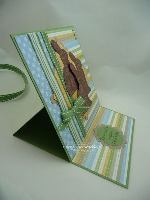
Here's what I came up with... It's not totally hideous. In fact, I think I kind of like how it turned out. I can't even remember the last time that I used a solid image that didn't require coloring!
 This chocolate bunny image from the current SU mini catalog was just too cute to resist. I clear embossed him on Close to Cocoa cardstock so he would be shiny.
Then I added some tiny green pearls to the top corner.
 And since I was already challenging myself with the sketch, I decided to take it a step farther and try another new technique. Easel cards seem to be all the rage these days, so I decided to give it a try. Here's what it looks like opened up...
I absolutely hate sketches with a tilted square.
Hate them.
When I saw the sketch over at Mojo Monday yesterday, it had a tilted square panel right smack dab in the middle - oh the horror! I decided to give it a whirl and step out of my comfort zone. After all, it IS supposed to be a challenge right?
Here's what I came up with...
 It's not totally hideous. In fact, I think I kind of like how it turned out. I can't even remember the last time that I used a solid image that didn't require coloring!
 This chocolate bunny image from the current SU mini catalog was just too cute to resist. I clear embossed him on Close to Cocoa cardstock so he would be shiny.
Then I added some tiny green pearls to the top corner.
 And since I was already challenging myself with the sketch, I decided to take it a step farther and try another new technique. Easel cards seem to be all the rage these days, so I decided to give it a try. Here's what it looks like opened up...


4 comments:
Beautiful card,i love your images and papers.
Hugs Riet.xx
aaawwwhhh! Love the bunnies! Very nice card!
This is adorable! I love it!
delicious! Those easel cards are so cool, I might have to try it:)
Post a Comment